
Airborne Airlines
Airborne Airlines fulfills a market need for an airline that promotes ultra-comfortable, economical flights.
Don’t like reading?
Watch the 6 minute video instead.
The Brief
Airborne Airlines wanted to expand on the UX research that had been conducted and my role was to complete the UI (user interface) design of their website. The brief was to build a high-fidelity prototype of a responsive website that allows users to save more money and stay on budget, while providing a description of the in-flight experience.
Research
Using the double diamond method I first sort to define the problem and set out some goals. To begin i looked at the research and learnings from the UX team, personas, looked at competitors in the market and evaluated the user testing insights.
Competitive Analysis
FINDING 1
Comfort not emphasized
Comfort elements are not mentioned in the flight booking process.
FINDING 2
Customization is crucial
Filters and personalization help users feel in control of their experience.
FINDING 3
Good design = trust/safety
Without a strong brand and design consistency people will not trust the airline
Define
Goal defined
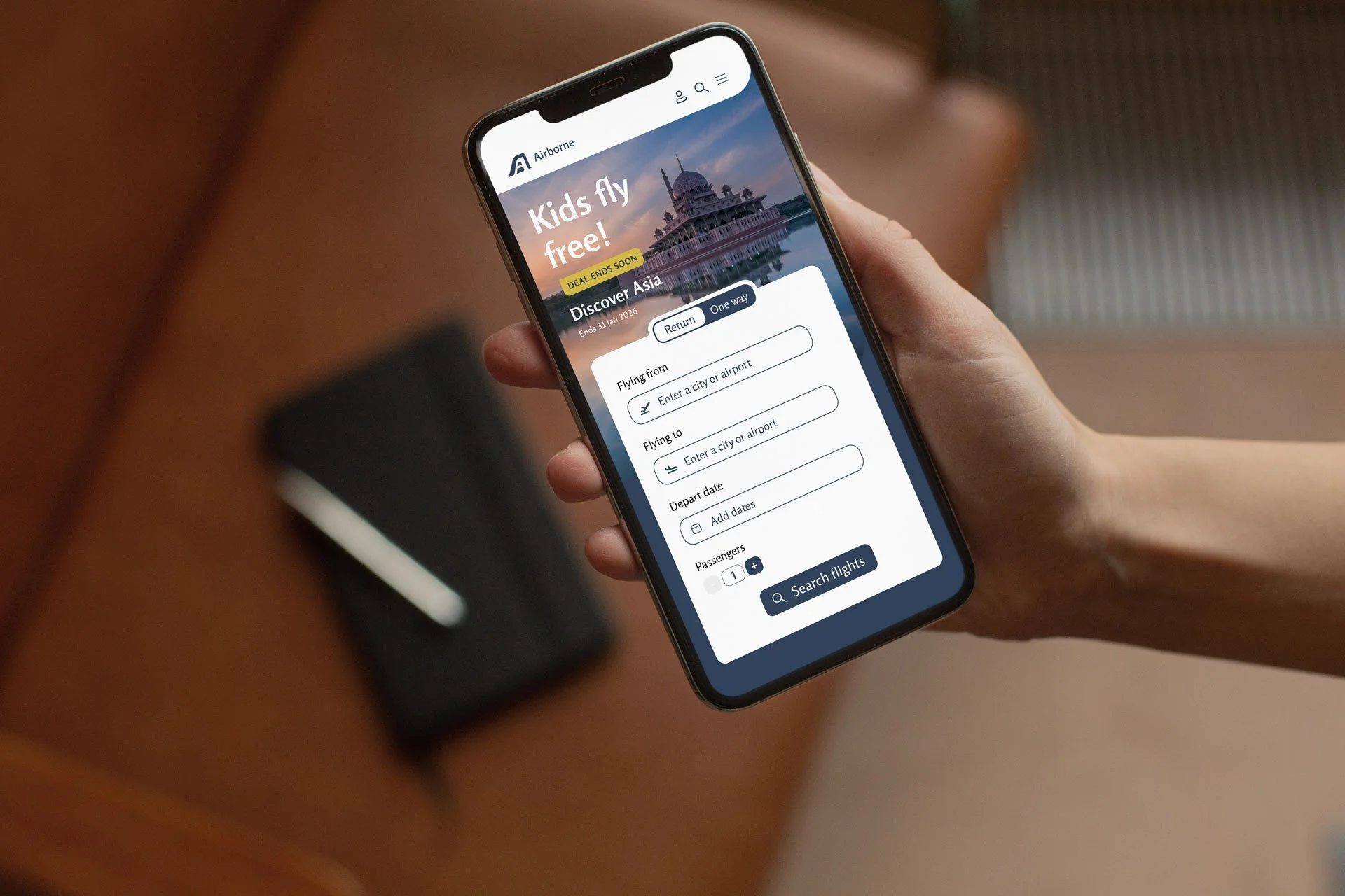
Make it easy to book a flight
Highlight comfort options
Make it easier to book a seat with extra leg room
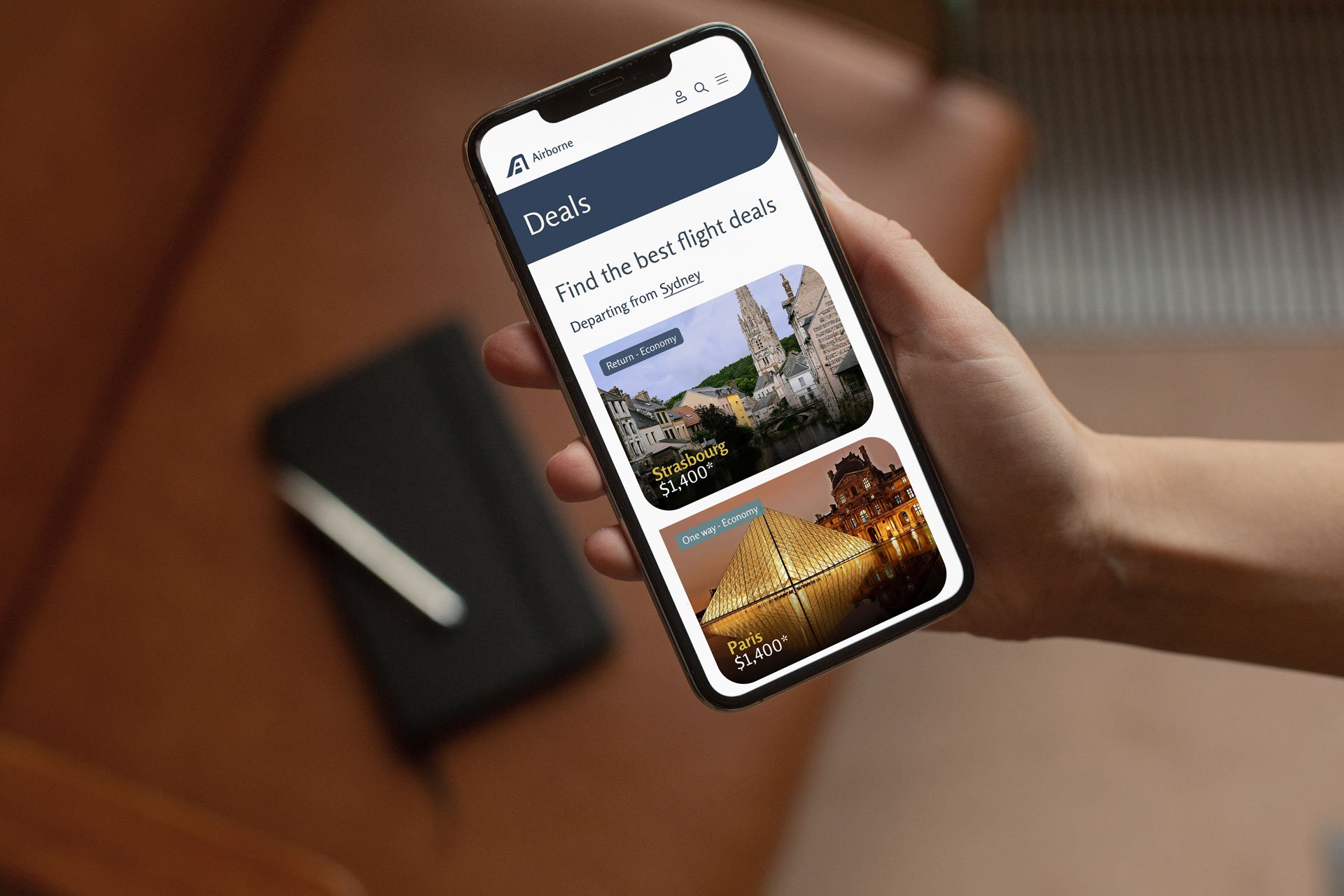
Make the deals more prominent
Make the ‘from location’ more obvious
Personas

The Comfort Seeker
Wants information and extra options to make their journey more comfortable

The Globe Trotter
A frequent traveller looking for economical deals
Pain points
Globe trotter was unsure of deal expiry dates
Comfort seeker not understanding what to expect from the flight and how their comfort needs might be met
Users missed the ‘from’ location in flight deals
Ideation
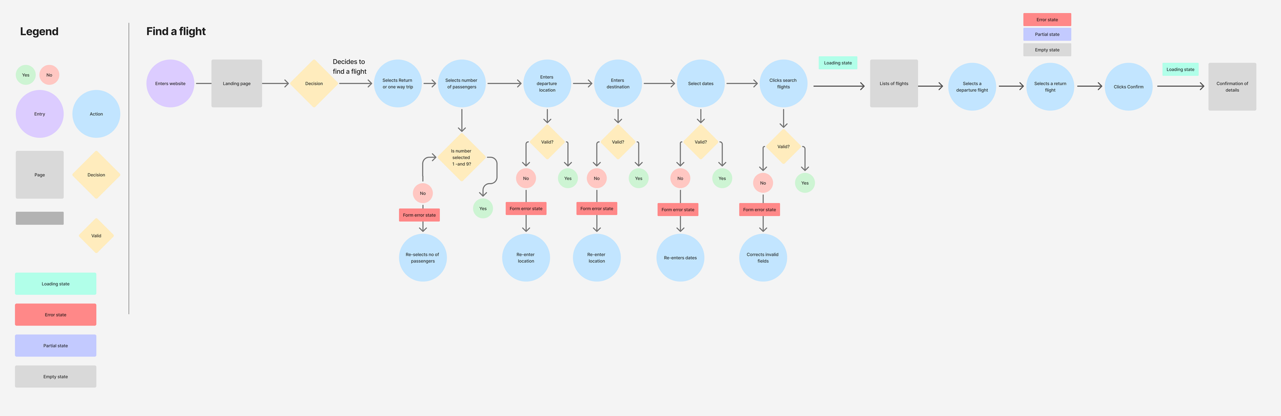
User flow
I mapped out the core user flow which aligned to user and company goals - to book a cheap flight with comfort features ie booking an exit row seat with extra leg room
Low fidelity prototype
Designing for mobile first, I began to design screens with a user-centred approach. The focus here was hierarchy and structure, less the visuals.
My aim was to create a calm and comforting user interface. Giving content ample space, seemed to be key. I also made sure key decision points—like sorting by price for the 'Deal Hunter' or viewing ‘Emergency exit seats availability’ for the 'Comfort Seeker'—were given prominence in the basic layout."
I used a generous spacing to keep the interface clean and ensured the layouts were responsive for mobile users from the start. We wanted the flow to be solid before adding any visual complexity.
Bringing the Brand to Life
Due to time constraints, I was unable to test the low fidelity prototype. I progressed to creating a polished mobile-first experience that was clean, comforting and intuitive.
Logo development (Coming soon)
Mood board and style guide
An initial mood board was developed and interestingly, the look and feel was modelled from a mid-century modern home I visited. The mid-century modern house interior gave the perfect blend of elegance and comfort that my users were looking for, and so many elements of the design were inspired by this design style.
A summary of my goals for the look and feel:
Elegant font
Rich, homely and comforting colours
Imagery is high end and sophisticated, unique and not stock looking
Consistent design system (typography, icons, components).
Clear visual indicators for deals (badges) and options.
“Good design is paramount to the user feeling a sense of safety and enhances trust for the company. ”
Testing
Using the think-Aloud method, I tested 3 users and asked them to narrate their thoughts while they followed the two assigned tasks using the HF protoype following the user flows.
Feedback
“I’m unsure if I’ve got an extra leg room seat. Is it just a plane that has extra leg room?”
User testing was critical to producing an intuitive product. I tested the prototype with 3 real users, observing their interactions and gathering feedback. This wasn't about testing the user; it was about testing the design. I tested the prototype with 3 real users and got them to complete 2 tasks, observing their interactions and gathering feedback. I then gathered and synthesised the insights gained into actionable tasks. A common pain point accross all 3 users was confusion around the extra leg room seat booking. From this feedback I made some crucial iterations for further testing.
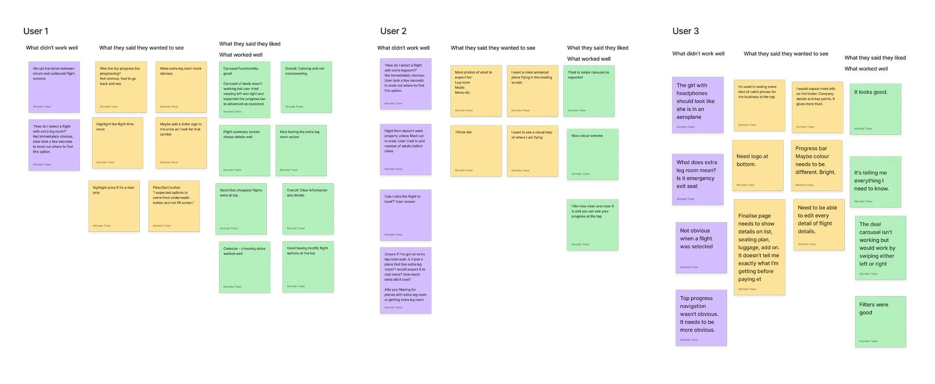
The user testing insights were compiled in FigJam and sorted into 3 categories and colour coded so that problem areas could be easily identified.
Problems
Booking progress bar was not obvious enough
Confusion about what extra leg room is or means
Confusion around what I’m getting before paying
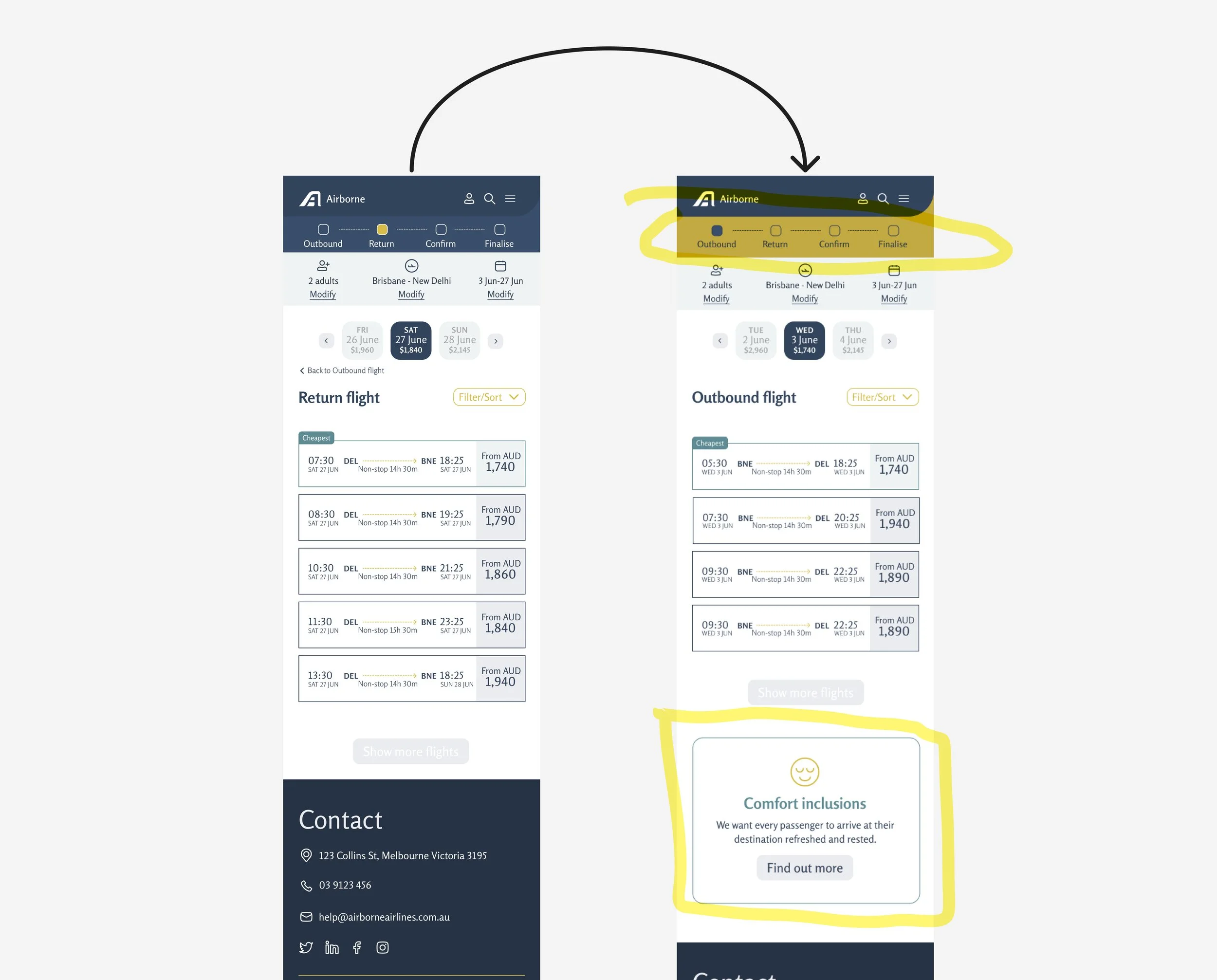
Transition between selecting inbound and outbound flights confusing. Not enough feedback from screen
Solutions
I made crucial iterations such as clarifying filter options, highlighting the progress bar and emphasising comfort features. These changes directly came from user testing insights.
High Fidelity Prototype
Take a look at the below video where I walk you through the high fidelity prototype.
Learnings and next steps
Don’t skimp on the step of mapping out the IA or low fidelity prototype. Get the structure right first before adding visuals. This will save time in the long run. The next step is to create more user flows, test, iterate and hand over to a developer.